FINAL FILM OPENING
'A Twisted Obsession'
Monday, 12 April 2010
Sunday, 11 April 2010
Looking back at your preliminary task, what do you feel you have learnt in the progression from it to the full product ?
 After watching both the preliminary task 'Out' and the final opening sequence of 'A Twisted Obsession' I feel I have learnt best how to edit to a good standard in After Affects after not knowing the programme before i started the preliminary task.
For the preliminary task we only cut the shots to run a bit smoother and added a main title and our names at the end. We used the 'add titles' function in Premier Pro which had a very unprofessional and dull outcome as we could only change the font, colour and fade. Whereas, for the final task I used After Affects which allowed me to add interesting backgrounds and tranisitions to the titles.
I also could change the position, scale, rotation and opactity to what we wanted making the whole production feel more edited to suit us which was better to work with as it wasn't restricting.
Creating the production logo was exciting as we could experiment with the transitions and various affects on After Affects making the sequence more engaging. Editing the shots with fades and making the music suit the action at each point added to the atmosphere we wanted resulting in an overall better product.
Furthermore, the camerawork improved alot as we had become more familiar with the processes and functions of the video camera. Using equipment like the tripod and wheeled tripod etc. made it easier to achieve steady footage leading to a more professional sequence.
Saturday, 10 April 2010
What have your learnt about technologies from the process of constructing this product ? This computer I used in the editing suite had many more programmes than I had used before such as; Premier Pro and After Affects.
I constantly used my mobile phone to contact the others in my group to schedule meetings or if I needed help with anything.
I had never used the Marantz voice -recorder but I had to for the voice-over in the at the end of our sequence. It was pretty simple to use and quick to import on to the computer.
I used the digital camera to take pictures of possible locations, meetings and the characters to upload on to my blog. A digital camera is easy to use as I have used them before and it is also simple to upload on to the computer.
Video camera was a bit confusing to use at first as there are several buttons but after getting used to it, it was simple. However, i wasnt the camerawoman so i didnt film anything in our sequence as I was acting. I did try to practice with the camera for my own knowledge and it was much easier using a Tripod to achieve clear, unshakey shots.
Programmes we used
- Adobe Premier Pro
We edited the sequence, added effects and titles on this programme
-Adobe After Affects
We created the animation of our text to evaporate and animated our logo to rotate and change size, changed colours to monochrome and red tint, added our soundtrack and voice over on to this, and created effects such as fade to our shots.
- Photoshop
We made our production logo on this.
- Google
Used to find images for my moodboard and look for research and our inspirations.
Also, i found sites on google to experiment with music, fonts and logos.
- Windows Media Player
We imported music via this from free play music.
- Facebook
We contacted each other via this.
-Blogger
Our work and planning is uploaded on to this.
-Youtube
I used Youtube to browse for clips to link to my influences and research and also, for clips of tutorials to help us with adding affects to our footage on after affects and premier pro.
-Soundcloud
I uploaded our soundtrack on to this and put it on my blog as a taster of our final soudtrack.
-Vimeo
Our roughcuts and final cut of our sequence was uploaded on this so we could then upload it onto our blogs. 
Friday, 9 April 2010
Thursday, 8 April 2010
What kind of media institution might distribute your media product and why?
Script
Anisha: We researched into thriller production companies, and decided on basing our production logo around ‘DNA film’ Production Company, they have produced similar films such as ‘Notes on a Scandal’. They have a similar plot to our film, so I think they would have an audience fan base that would enjoy watching our film.
Riham: We created this logo to represent our genre as well as our production company; we achieved this by designing a logo that was young, sexy whilst maintaining a professional standard of a production logo.
Anisha: The main aim of a production company is to be responsible for the sole legal ownership of a film. In addition, they oversee the management and the financial aspects of the film. We would like to work with DNA film because they are professional and have produced a variety of thriller based films such as 28 Weeks Later.
Riham: The different ways we would distribute our film is through advertising on local social networking websites such as Facebook because statistics show that since the launch of Facebook in 2004 the number of active users has jumped from 130,000 to 43 million, the majority being teenagers, which brings us back to our target audience. Also, we could advertise mini trailers on video streaming sites such as YouTube and Vimeo etc. Furthermore, we could privately distribute through selling copies of our film on DVD or selling it in a variety of stores through a distribution company such as Fox Searchlight Pictures.
Anisha: To gain money for our film, we could look into film funding grants within London such as Film London (since 2004), as they provide money for short film makers within London boroughs and First Light, they fund through the UK Film Council and directly from the Department for Children, Schools and Families.
Riham: We looked at a variety of opening title sequences such as SE7EN, Batman Begins etc to get examples of the main job titles that would be shown in the first two minutes; we then referred back to the title openings to order our credits.
Anisha: We included these titles in this specific order..
-Starring = we incorporated this first so that the audience would be able to identify who the main celebrities are reflecting from the Polaroid’s.
-Director = we included this so that the audience could be familiar with the type of film’s she produces, which gives them certain expectations.
-Costume Design =we got a famous costume designer, so that the audience would know that costume is key to identify our characters.
-Executive Producer, Film editor, Director of photo = we included these titles as they played a main part throughout the entire film, also these titles are included in all the title sequences that we research, therefore it was important to include.
-Main title =we included this last to add mystery to the climax of the opening sequence, and being the last title in the opening sequence, it would linger in the audience’s mind.
Riham: We would release our film in a similar way to Notes on a Scandal by distributing our film at limited cinemas such as vue in major city to begin with, because it will enhance audience anticipation also to see if it becomes a success in the major city.
Anisha: Therefore, if successful we will then decide to distribute into further cities. In addition, we could set up a viral campaign (a mini trailer) and posters to advertise and encourage the audience to watch our film.
How does your media product represent particular social groups ?
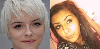
Both Lydia and Leanne play a similar role in their dramas as they are both lesbian, obsessed characters. Their role requires both girls to act in a sly, obsessive way; taking posessions and becoming almost a stalker just to make sure their love is alrite and not being distracted by males.
Also they both share similar characteristics;
-they both are vague and disturbed in their emotions towards a friend of theirs.
-they both are not very popular and dont have many friends but try to fit in with others at college.
-they both have family problems and no father figure resulting in their attitude probably leading them to be a bit too comfortable around girls.
However, there are several differences as we tryed to challenge the stereotypes of the appearance of lesbians. Lydia's appearance is more typical; the short hair and her funky dress sense whereas Leane is quite conscious about her pretty look and dresses more stylish and simple. Therefore, this does challenge the stereotypes and is engaging for the audience as they wouldn't expect Leanne to be a lesbian.
Lydia from Hollyoaks was a big inspiration to our character of Leanne, as i watch Hollyoaks and see the twisted measures Lydia goes too for Sarah and what her life is like and how she deals with jelousy, mainly with anger .
Our media final sequence represents social groups in a similar way Hollyoaks does but with a twist as we wanted to test stereotypes, however it will still only draw a set target audience.
In what way does your media product use, develop or challenge forms and conventions of real media products ?
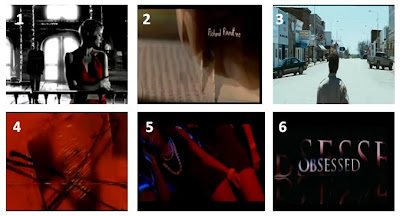 1-Sin city
2-Se7en
3-The Crazies
4-Se7en
5-4321
6-Obsessed
1-Sin city2-Se7en
3-The Crazies
4-Se7en
5-4321
6-Obsessed
__________________________________________________________
 1- This first medium close- up shot which then zooms in, is used to establish the key protagonist in the monochrome effect creating a dark atmosphere suggesting the movie is a horror/thriller based genre from the start to help the audience establish this.
*This shot is similar to 'Sin City' as that opening sequence is also in a monochrome effect. However, they added some red on one character as it highlights her as the protagonist and connotes love and danger at the same time.
2- The titles appear after every mini shot in our opening sequence with polaroids and credits introducing the two protagonists and illustrating a relationship between them aswell as moving time along. This is not used commonly in movies but is a good way to introduce characters and link to our target audience as they most probably take pictures like this with their friends.
*The title sequence of 'Se7en' make the titles appear over the footage in a mysterious effect. The font is small but effective as it sets a genre and reflects the vague footage.
3- A series of close-ups of Toni were put together to produce a montage to help the audience establish the other protagonist and a bit of her characteristics, she looks very happy and bubbly but almost like a victim in this clip. Leaving the audience with this sense of mystery creates an enigma code and possibly question why these shots are relevant ? or who was this clip taken by?
4- The location/setting varies through the sequence but with this shot we are trying to show the different measures Leanne goes through for Toni, following her in various locations which you can tell is ot her first time. This setting is almost abandoned which adds to the atompshere of the thriller based genre as locations like this are commonly used in thrillers.
*'The Crazies' establishing shot of there setting is different to ours as it is a very large landscape but it is still abandoned which is the same as our location achieving a similar effect of mystery and anxiety.
5- This shot almost unfolds the storyline and gives the audience a hint of a possible plot as they know the main title and can see by now the polaroids, previous footage and that she is stalking who is meant to be her friend. The sly behaviour and soundtrack is very mysterious leading the audience to assume feelings are involved resulting in the 'twisted obsession'.
6- We used a red filter at this point to enhance the key themes as red connotes alot; love, danger, passion and death. This could leave the audience to wonder which themes are included helping them establish a storyline. This effect is most commonly used in movies where someone is developing pictures in a dark room which gives a very ambiguous atomsphere reflecting on the genre.
*This effect is used in the opening title sequence for 'Se7en'.
7- This shot introduces Leanne as the obsessed one, her pyschotic fit over pictures of her friend reveals her passion and anger towards her feelings for Toni. The storyline is pretty obvious by now and the mental state of Leanne suggests the genre to be more thriller/horror based.
8- The main title suggests a hint of what the storyline would be about especially as it appears after the footage that introduces the characters, relationship and the genre also creating an enigma code so the audience feel involved. In addition the title name reflects on the genre and the font style as it is kept simple and the 'evaporate' effect implies a sense of vagueness.
*'Obsessed' use a fade in the way there titles appear creating a similar effect of anonymity as us.
9- Leanne's make-up is very exaggerated illustrating the confused, upset state she is in as she looks very rough. Her costume; a cardigan, graphic vest and leggings is very young, stylish yet simple creating a link with our target audience as costume represents a character and their traits to make it easier for the audience to relate to.
*In '4321' the costumes and make-up of each individual evokes their personality and youth which also engages a certain audience and helps them relate to the characters making it interesting for them to watch.
Subscribe to:
Comments (Atom)