FINAL FILM OPENING
'A Twisted Obsession'
Monday 12 April 2010
Sunday 11 April 2010
Looking back at your preliminary task, what do you feel you have learnt in the progression from it to the full product ?
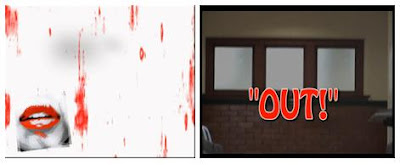 After watching both the preliminary task 'Out' and the final opening sequence of 'A Twisted Obsession' I feel I have learnt best how to edit to a good standard in After Affects after not knowing the programme before i started the preliminary task.
For the preliminary task we only cut the shots to run a bit smoother and added a main title and our names at the end. We used the 'add titles' function in Premier Pro which had a very unprofessional and dull outcome as we could only change the font, colour and fade. Whereas, for the final task I used After Affects which allowed me to add interesting backgrounds and tranisitions to the titles.
I also could change the position, scale, rotation and opactity to what we wanted making the whole production feel more edited to suit us which was better to work with as it wasn't restricting.
Creating the production logo was exciting as we could experiment with the transitions and various affects on After Affects making the sequence more engaging. Editing the shots with fades and making the music suit the action at each point added to the atmosphere we wanted resulting in an overall better product.
Furthermore, the camerawork improved alot as we had become more familiar with the processes and functions of the video camera. Using equipment like the tripod and wheeled tripod etc. made it easier to achieve steady footage leading to a more professional sequence.
Saturday 10 April 2010
What have your learnt about technologies from the process of constructing this product ? This computer I used in the editing suite had many more programmes than I had used before such as; Premier Pro and After Affects.
I constantly used my mobile phone to contact the others in my group to schedule meetings or if I needed help with anything.
I had never used the Marantz voice -recorder but I had to for the voice-over in the at the end of our sequence. It was pretty simple to use and quick to import on to the computer.
I used the digital camera to take pictures of possible locations, meetings and the characters to upload on to my blog. A digital camera is easy to use as I have used them before and it is also simple to upload on to the computer.
Video camera was a bit confusing to use at first as there are several buttons but after getting used to it, it was simple. However, i wasnt the camerawoman so i didnt film anything in our sequence as I was acting. I did try to practice with the camera for my own knowledge and it was much easier using a Tripod to achieve clear, unshakey shots.
Programmes we used
- Adobe Premier Pro
We edited the sequence, added effects and titles on this programme
-Adobe After Affects
We created the animation of our text to evaporate and animated our logo to rotate and change size, changed colours to monochrome and red tint, added our soundtrack and voice over on to this, and created effects such as fade to our shots.
- Photoshop
We made our production logo on this.
- Google
Used to find images for my moodboard and look for research and our inspirations.
Also, i found sites on google to experiment with music, fonts and logos.
- Windows Media Player
We imported music via this from free play music.
- Facebook
We contacted each other via this.
-Blogger
Our work and planning is uploaded on to this.
-Youtube
I used Youtube to browse for clips to link to my influences and research and also, for clips of tutorials to help us with adding affects to our footage on after affects and premier pro.
-Soundcloud
I uploaded our soundtrack on to this and put it on my blog as a taster of our final soudtrack.
-Vimeo
Our roughcuts and final cut of our sequence was uploaded on this so we could then upload it onto our blogs. 
Friday 9 April 2010
Thursday 8 April 2010
What kind of media institution might distribute your media product and why?
Script
Anisha: We researched into thriller production companies, and decided on basing our production logo around ‘DNA film’ Production Company, they have produced similar films such as ‘Notes on a Scandal’. They have a similar plot to our film, so I think they would have an audience fan base that would enjoy watching our film.
Riham: We created this logo to represent our genre as well as our production company; we achieved this by designing a logo that was young, sexy whilst maintaining a professional standard of a production logo.
Anisha: The main aim of a production company is to be responsible for the sole legal ownership of a film. In addition, they oversee the management and the financial aspects of the film. We would like to work with DNA film because they are professional and have produced a variety of thriller based films such as 28 Weeks Later.
Riham: The different ways we would distribute our film is through advertising on local social networking websites such as Facebook because statistics show that since the launch of Facebook in 2004 the number of active users has jumped from 130,000 to 43 million, the majority being teenagers, which brings us back to our target audience. Also, we could advertise mini trailers on video streaming sites such as YouTube and Vimeo etc. Furthermore, we could privately distribute through selling copies of our film on DVD or selling it in a variety of stores through a distribution company such as Fox Searchlight Pictures.
Anisha: To gain money for our film, we could look into film funding grants within London such as Film London (since 2004), as they provide money for short film makers within London boroughs and First Light, they fund through the UK Film Council and directly from the Department for Children, Schools and Families.
Riham: We looked at a variety of opening title sequences such as SE7EN, Batman Begins etc to get examples of the main job titles that would be shown in the first two minutes; we then referred back to the title openings to order our credits.
Anisha: We included these titles in this specific order..
-Starring = we incorporated this first so that the audience would be able to identify who the main celebrities are reflecting from the Polaroid’s.
-Director = we included this so that the audience could be familiar with the type of film’s she produces, which gives them certain expectations.
-Costume Design =we got a famous costume designer, so that the audience would know that costume is key to identify our characters.
-Executive Producer, Film editor, Director of photo = we included these titles as they played a main part throughout the entire film, also these titles are included in all the title sequences that we research, therefore it was important to include.
-Main title =we included this last to add mystery to the climax of the opening sequence, and being the last title in the opening sequence, it would linger in the audience’s mind.
Riham: We would release our film in a similar way to Notes on a Scandal by distributing our film at limited cinemas such as vue in major city to begin with, because it will enhance audience anticipation also to see if it becomes a success in the major city.
Anisha: Therefore, if successful we will then decide to distribute into further cities. In addition, we could set up a viral campaign (a mini trailer) and posters to advertise and encourage the audience to watch our film.
How does your media product represent particular social groups ?
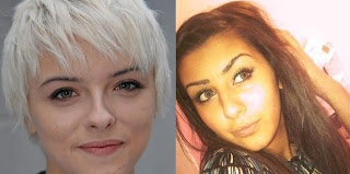
Both Lydia and Leanne play a similar role in their dramas as they are both lesbian, obsessed characters. Their role requires both girls to act in a sly, obsessive way; taking posessions and becoming almost a stalker just to make sure their love is alrite and not being distracted by males.
Also they both share similar characteristics;
-they both are vague and disturbed in their emotions towards a friend of theirs.
-they both are not very popular and dont have many friends but try to fit in with others at college.
-they both have family problems and no father figure resulting in their attitude probably leading them to be a bit too comfortable around girls.
However, there are several differences as we tryed to challenge the stereotypes of the appearance of lesbians. Lydia's appearance is more typical; the short hair and her funky dress sense whereas Leane is quite conscious about her pretty look and dresses more stylish and simple. Therefore, this does challenge the stereotypes and is engaging for the audience as they wouldn't expect Leanne to be a lesbian.
Lydia from Hollyoaks was a big inspiration to our character of Leanne, as i watch Hollyoaks and see the twisted measures Lydia goes too for Sarah and what her life is like and how she deals with jelousy, mainly with anger .
Our media final sequence represents social groups in a similar way Hollyoaks does but with a twist as we wanted to test stereotypes, however it will still only draw a set target audience.
In what way does your media product use, develop or challenge forms and conventions of real media products ?
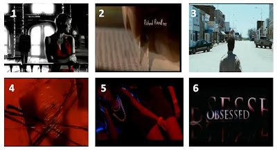 1-Sin city
2-Se7en
3-The Crazies
4-Se7en
5-4321
6-Obsessed
1-Sin city2-Se7en
3-The Crazies
4-Se7en
5-4321
6-Obsessed
__________________________________________________________
 1- This first medium close- up shot which then zooms in, is used to establish the key protagonist in the monochrome effect creating a dark atmosphere suggesting the movie is a horror/thriller based genre from the start to help the audience establish this.
*This shot is similar to 'Sin City' as that opening sequence is also in a monochrome effect. However, they added some red on one character as it highlights her as the protagonist and connotes love and danger at the same time.
2- The titles appear after every mini shot in our opening sequence with polaroids and credits introducing the two protagonists and illustrating a relationship between them aswell as moving time along. This is not used commonly in movies but is a good way to introduce characters and link to our target audience as they most probably take pictures like this with their friends.
*The title sequence of 'Se7en' make the titles appear over the footage in a mysterious effect. The font is small but effective as it sets a genre and reflects the vague footage.
3- A series of close-ups of Toni were put together to produce a montage to help the audience establish the other protagonist and a bit of her characteristics, she looks very happy and bubbly but almost like a victim in this clip. Leaving the audience with this sense of mystery creates an enigma code and possibly question why these shots are relevant ? or who was this clip taken by?
4- The location/setting varies through the sequence but with this shot we are trying to show the different measures Leanne goes through for Toni, following her in various locations which you can tell is ot her first time. This setting is almost abandoned which adds to the atompshere of the thriller based genre as locations like this are commonly used in thrillers.
*'The Crazies' establishing shot of there setting is different to ours as it is a very large landscape but it is still abandoned which is the same as our location achieving a similar effect of mystery and anxiety.
5- This shot almost unfolds the storyline and gives the audience a hint of a possible plot as they know the main title and can see by now the polaroids, previous footage and that she is stalking who is meant to be her friend. The sly behaviour and soundtrack is very mysterious leading the audience to assume feelings are involved resulting in the 'twisted obsession'.
6- We used a red filter at this point to enhance the key themes as red connotes alot; love, danger, passion and death. This could leave the audience to wonder which themes are included helping them establish a storyline. This effect is most commonly used in movies where someone is developing pictures in a dark room which gives a very ambiguous atomsphere reflecting on the genre.
*This effect is used in the opening title sequence for 'Se7en'.
7- This shot introduces Leanne as the obsessed one, her pyschotic fit over pictures of her friend reveals her passion and anger towards her feelings for Toni. The storyline is pretty obvious by now and the mental state of Leanne suggests the genre to be more thriller/horror based.
8- The main title suggests a hint of what the storyline would be about especially as it appears after the footage that introduces the characters, relationship and the genre also creating an enigma code so the audience feel involved. In addition the title name reflects on the genre and the font style as it is kept simple and the 'evaporate' effect implies a sense of vagueness.
*'Obsessed' use a fade in the way there titles appear creating a similar effect of anonymity as us.
9- Leanne's make-up is very exaggerated illustrating the confused, upset state she is in as she looks very rough. Her costume; a cardigan, graphic vest and leggings is very young, stylish yet simple creating a link with our target audience as costume represents a character and their traits to make it easier for the audience to relate to.
*In '4321' the costumes and make-up of each individual evokes their personality and youth which also engages a certain audience and helps them relate to the characters making it interesting for them to watch.
Saturday 27 February 2010
RATING
 I looked at the British Board of Film Classification (BBFC) guidelines to choose an appropriate rating for our opening sequence. I came to the conclusion of a rating 15 as we would commonly use strong language like 'f***' and 'c***' etc as well as moderate language such as 'bitch' and 'twat' may be used to represent youth.
Also, as our film is about teens a stereotypical way to present them would be with some drug use, sex, strong violence and dangerous behaviour (hanging, suicide and self-harming) are acceptable under the rating of 15 however, it cannot be too detailed or unjustified and should not be glamorised. At some point in the movie there could be a fight at school or Leannecould self-harm herself which adds to a hardcore atmosphere.
FEEDBACK AND COMMENTS FOR IMPROVEMENT


Once i got this feedback from my teacher and relised my target was at an A/B standard i completed the improvement points and completed everything else to a high standard ensuring it was all done before the deadline of the 1st April.
COMMENTS
- 'very good but you need to make the storyline more obvious'
- 'i liked it but i think you should add a shot of Leanne following Toni to make sure the storyline is clear'
- 'maybe the happy shots of Toni should be in colour'
- 'good, intense soundtrack'
- 'your titles need to appear slower so they are readable'
- 'wicked'
- 'the soundtrack should drop in time with Leanne when shes having her breakdown'
- 'some shots are very blurry and shakey'
After recieving these comments of feedback we decided to take on board some suggestions for improvement and played around to see which points could help our sequence look proffesional as well as keeping the audience engaged. improvement and played around to see which points could help our sequence look proffesional as well as keeping the audience engaged.
We decided to change the colour of the last shot in the toilets to a red tint to make it look more effective as the colour red was a key connotation throughout our sequence as it represents love, danger and passion; the main themes of our movie.
We also decided to add a shot of Leanne following Toni home to try make the storyline obvious as some people suggested, we think this shot achieves this as Toni is clueless to Leanne following her and the music at this point evokes Leanne's sly movements to eventually becoming obsessed with Toni and wanting to be with her always.
We added a voiceover which is a sentence to tighten the whole theme or plot of our movie helping the audience establish what could be going on and engaging the audience from the start as they would want to keep watching to find out what happens and how she deals with her feelings and if it would be a happy ever after ending.
For the titles we learnt how to slow the writing down still with the evaporate and word flash effect reflecting our genre. We also added polaroids of Leanne and Toni every time a title came up so the audience could identify the protagonist and possibly a bit about the storyline.
We pulled back the soundtrack on after affects so it flows with the footage better and actually makes an empact on the action going on.
We kept the blurry effect at the end of each zoom shot as it adds a confused effect which reflects on Leanne's behaviour as she is confused about what she wants to do with Toni or why shes having these feelings for her. The shakey camera shots also demonstrate this complicated, troubled feeling towards Leanne.
Once we had roughly edited our opening sequence as in; removed the unnecessary shots, put all the shots in the right order, shortened some shots, added the fade at the end of each shot, changed the whole sequence to be in monochrome, added the production logo, titles and the soundtrack.
We showed it to several people in the school to recieve positive feedback or constructive criticism to help us make the sequence the best we can to engage our audience and satisfy them.
Friday 26 February 2010
Thursday 25 February 2010
PRODUCTION LOGO
I did some research into looking at different production logos and how they are meant to look and how professional others look.


These two production logos are very famous and well known and audiences know what to expect from a movie represented by this production. The logos themselves are very simple yet effective having one or two key colours and the name of the production written in a big font size.
 we edited it and animated it on photoshop which in the end result has quite a sexy and young feel as well as looking professional.

I did some research into looking at different production logos and how they are meant to look and how professional others look.


These two production logos are very famous and well known and audiences know what to expect from a movie represented by this production. The logos themselves are very simple yet effective having one or two key colours and the name of the production written in a big font size.
We could easily achieve something like this but as we are only doing one movie we could portray a bit of the genre in the production logo so the audience could establish the genre right from the start.
I then looked at some sites to create a logo on;
http://cooltext.com/
http://www.avsforum.com/avs-vb/showthread.php?t=715166
cooltext was pretty simple and straight forward but the other site was a bit confusing so as a group we decided to produce the logo ourselves.
http://cooltext.com/
http://www.avsforum.com/avs-vb/showthread.php?t=715166
cooltext was pretty simple and straight forward but the other site was a bit confusing so as a group we decided to produce the logo ourselves.
We took a picture of Georgina's lips an finger;
we edited it and animated it on photoshop which in the end result has quite a sexy and young feel as well as looking professional.We added our Production name testing out different fonts and decided on this final one;
'chiller'
'chiller'
The picture and font are reflected on the actual opening sequence itself with the seductive, strong image and unique font engaging the audience right at the start of the sequence.
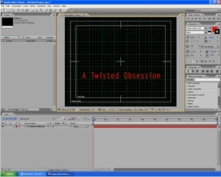
Then using the Adobe After Effect programme we were playing around to see how we want the logo to enter the screen, we experimented with the; position, scale, rotation and opacity to create an exciting animated effect. We also made our production name appear swiftly by adding the blur effect slowly turning into the clear font. Finally we added an engaging background which is simple and still keeps the audience looking at the production logo and focusing on the production name.
We created a 5 second animation for when the production logo and name enters the shot at the start of the movie to let the audience know it has our name on it and it is a production from us which can then help people to associate the logo to our productions. If we were to make another movie and use this production logo, people will then associate the logo to us three and know what to expect from a movie under this production.
VOICEOVER
'I never thought i could love you, but i can't help it anymore'
We imported this voiceover at a specific point in the sequence when the main title appears just before Leanne is looking at herself in the mirror.
Firstly, we had to remove all the original audio from our filming because we only wanted a soundtrack playing to add an atmosphere. Towards the end of the opening sequence we imported the voiceover which was only one line but could help people establish a simple outline of the rest of the movie and the emotion of the character Leanne.
We did this using Premier Pro;

SOUNDTRACK
We originally wanted to create our own soundtrack as we could alter the beats to suit our movie perfectly and it would have been fun and interesting. However, we couldn't find any programmes or software that would be easy or accessible to use. We had a friend that works in a recording studio, so we tried to create a beat in this studio. However, we couldn't spend too much time in there as my friend was very busy and we felt we would need a lot of time to get used to the buttons as it was confusing to create the right beat as we had to ensure it flowed with our footage to enhance the appropriate atmosphere so instead we looked into some music sites via google.
Finally, we decided to use a website we found online; http://www.freeplaymusic.com/ which had loads of various tunes and beats. After we browsed the website we found a selection of beats that created a mysterious atmosphere and held suspense. We listened to each of them carefully whilst watching our sequence to see if they suited and found one perfect match. We knew we had to find a perfect soundtrack as it was important to achieve the right mood for our sequence and to ensure it related to our genre.
Soundtrack below;
Victim Pileup by x_nish_x
EXPERIMENTING WITH FONTS FOR TITLES
I looked at this website to find appropriate typography for our titles; http://www.flamingtext.com/
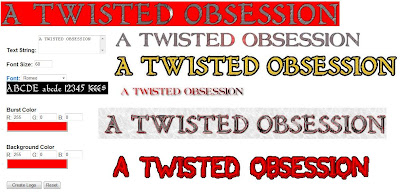
I tested out some differnt fonts experimenting with different colours, background colours and fonts to ensure we picked the perfect, most professional font for our titles but i didnt think any of these looked right or professional enough so we didnt use any of these.
Instead we just used a simple and clear font from the Adobe After Effect programme but changed the colour to red as that is a key colour running through our opening sequence and production logo connoting danger as well as love.

We also looked through effects and presets to see how we want the writing to enter the shots and decided to merge 'evaporate' and 'wordflash' together, these both work together to create the effect which adds suspense and is interesting to watch.
Meeting 8
-we had a training session to learn how to use sound, special effects, looked at various camera techniques and interesting ways we can make the titles enter and appropriate, professional fonts
-we then edited our sequence deciding which soundtrack we will use reflecting our atmosphere and suiting our genre.
-we tested out different special effects on the software Adobe like; monochrome, red filters etc.
-I tested out different fonts for our credits and titles.
Meeting 9
-we researched into logos and names and chose 'Rage Ent.'
-we then did our voiceover and imported it
Wednesday 24 February 2010

PRODUCTION BRIEF
Opening Sequence Title – A Twisted Obsession
Length – 2/3 minutes
Group Members
The group is made up of 3 of us; Me, Anisha and Georgina. Anisha and I will be acting as the protagonists in this sequence and Georgina will be filming. We all collectively are planning and editing the finished film.
Content Overview
Leanne and Toni have been best friends for years and Leanne finally felt like she had settled in a place of her own after having moved around a lot when she was younger. As they grew up Leanne’s feelings of friendship slowly evolved into something more as she had never experienced such a closeness before. She begins to show signs of obsession by stealing some of Toni’s possessions and takes photo’s of her and puts in her scrapbook which is full of pictures of Toni. Toni becomes a little suspicious of Leanne’s changing behavior towards her, and finally decides to confront her where Leanne then leaks all her built up feelings and to her surprise Toni does not feel the same. Toni feels outraged and Betrayed as Leanne try’s to express the depth of her emotions hoping she would understand and ultimately return the love. A confused Toni refuses and Leanne’s feelings turn aggressive and lead her to attacking Toni in evil ways.
Target Audience
We have targeted our sequence to Teenagers, male and female but most probably more to females as the protagonists are also females. We believe that considering their lifestyle and their adolescent position this movie would appeal to them as they may feel they could relate to the characters lifestyle. A lifestyle consisting of fast paced and continually exciting obstacles as teenagers stereotypically are known to be hyper and stimulating searching for exciting things to do and see. Teenagers would also be more likely to notice film advertising as they are mostly media aware and would feel more prone to watch it but this also depends on our marketing methods.
Research
We researched into a couple of programmes that target at teenagers, dramas such as ‘Skins’ and ‘Hollyoaks’ which connote a strong influence of youth which we have considered in our movie opening sequence. These collectively have given us a wide variety of information to consider to put into our sequence which would benefit us appealing to our target. We have also analysed and watched many title sequences to know the elements we need to include in order to make it obvious what genre it is but to still keep the audience intrigued and what made them successful.
I analysed the opening of the film ‘Batman’, the film included various traditional conventions of a action-thriller managing to uphold a strong level of suspense throughout the entire opening. We want to do something similar and include certain conventions of a thriller but also with a twist of certain stereotypes in society to keep our audience engaged.
Representations and Stereotypes
The Stereotype that we will be focusing on and illustrating is one of a troubled teenager. We will twist the current stereotype of all teens being represented through ‘hoodys’, ‘guns and knives’ and ‘gangs’ in the media. We plan to exaggerate on the fact that teenagers have a deep, emotional side to them, in this case it leads to her eventual devastation.
Twisting the traditional assumptions of teenagers being wild and rude to instead demonstrating our characters as disturbed and obsessed.
Also the representations of friendships will is traditionally portrayed to be perfect, however we plan to prove how they can develop into something ugly. We will show the innocent side of a friendship contrasting to a sly and difficult bond uncovering motivated situations. This will challenge the stereotypical representations of the perfect friendship and gang associated youths which would hopefully result in our audience feeling engaged.
How will we check the movies success
We will undergo a private screening of our opening sequence to our class and some external people. We would expect to get both positive and negative criticism to help us improve whatever we need to. Once we receive feedback we will then improve the sequence to suit the specific aspects we were negatively commented on. This will then hopefully ensure our film meets our audiences standard and achieve the engaging effect wanted.
Conventions
Conventions of a thriller are very specific and we need to ensure we include them so they run professionally and so the audience could establish the genre quickly. Stereotypical conventions of a Thriller we plan to apply;
the upholding sense of suspense
no sound being used at first creating mystery
the concept of a villain and helpless character
lots of different camera angles altering in a fast pace
images not being clear or focused at first
an eerie, disturbing atmosphere
the mysterious experience created by lack of knowledge at first.
Constraints
time is a massive constraint as we would not always be together and do not always have time to focus on just media. Also we are all based at different sites which isn’t easy, meaning that a lot of planning has to be done in rough or over msn or facebook and then when we meet each other we discuss everything together which gets overwhelming. The use of school equipment is hard and confusing as we need training sessions for most programmes and in how to use cameras etc. Some days the weather may not be perfect meaning we would have to either adapt of postpone filming which would put back our production process.
TREATMENT OF OPENING
As a group we thought of several different titles that would engage an audience and for them to know it would be interesting to watch. As our main themes are friendships, love and obsession we tried to combine them to make an title. Our title ideas:
-Possessed
-Unwanted Possession
-Twisted Love Story
-A Twisted Obsession
-Love's Demise
We all agreed on 'A Twisted Obsession' as it was mysterious yet represented a base of the storyline within two words.
Our plot is based on the developed obsession Leanne is feeling towards Toni after being best friends for over 5years. Leanne begins to steal some of Toni's possesions, take continuous pictures of her and she later creates a scrapbook dedicated to the love of her life, Toni.
As she spends more and more time with Toni at school and out of school, her feelings just keep growing but Toni begins to get suspicious of Leanne's behaviour and she begins to get jelouse when boys talk to the popular Toni and if shes out with other friends other than her.
She eventually confronts Toni by letting out all her locked up emotions hoping Toni would understand and almost love her back. To Leanne's suprise Toni does not return the love and feels betrayed and runs away not wanting to ever see Leanne again.
However, Leanne's long term feelings dont just vanish and she becomes aggressive, she finds Leanne after college one day and her emotions turn physical leading to her raping and beating Toni which results in Toni commiting suicide.
After that, towards the end of the movie Leanne realises she is disturbed and as the police are looking for her she also commits suicide as she believes she deserves to die.
As we are only producing the opening sequence of this movie, we have to make sure it was engaging so the audience would want to watch till the end.
In our opening sequence, we plan to use a series of short shots linking together to ensure the audience have established the storyline but keeping the enigma code effect by not showing too much and leaving the audience wanting to watch to see what happens.
Our planned shots will consist of;
-Our sequence opens with our production logo, with the soundtrack already playing.
-A close-up shot of Leanne's face is zoomed into, she looks very happy as she is huging Toni and playing with her hair.
*Title
-Another close-up shot but of Toni's face is zoomed out of as she looks happy being with Leanne.
*Title
-Close-ups, Extra close-ups, Medium shots of Toni creating the effect that shes being watched.
*Title
-A medium shot and match on action shot of Toni walking home through a gate
-A long shot of Leanne slyly coming through the gate after Toni
-Over the shoulder shot of Leanne following Toni
*Title
-Close-ups of polaroids on the mirror and Leanne stroking them
-As the beat drops, Leanne goes mad as she thinks she'll never get to be with Toni and starts to rip the pictures of the mirror
-A medium shot of Leanne leaning over the sink and looking up at the mirror in deep pain
*Main Title and voice over
-A zoom in shot of a distraught Leanne staring at her self in the mirror
Tuesday 23 February 2010
INFLUENCES AND RESEARCH
I did some research into looking at homosexual based or obsessed based storylines and found several movies and dramas;
-Notes on a Scandal
-My Summer of Love
-The Incredibly True Adventure of Two Girls in Love
-Lost and Delirious
-Obsessed
-Desperate Housewives
-Hollyoaks
-Skins
Many of the movies and dramas focusing on homosexuality demonstrate that three is a crowd or a couple in a sly plot and they don't want the world to know. In some dramas the actors dont even realise that they are actually gay until put in a situation.
Obsessed based movies and dramas present obsession mainly towards another person and that person tends not to know what is going on or doesn't feel the same way and is usually medaling in a couples relationship.
We came together and decided to use Hollyoaks' Lydia, Sarah and Zoe's love triangle episode as our main influence. All three of us identifed this drama in our research as it best presents most of our ideas and conventions for our own movie plot and creates the key atmosphere helping to establish the genre.

In this intriguing Hollyoaks storyline, the key character Lydia is a lesbian who feelings develop for sarah as she spends more and more time with her and she becomes obsessed with her; always wanting to be around her, controlling who her friends are and even trying to manipulate her into believing her bestfriend is a jealous bitch as Lydia knows Zoe is a threat to her.
Her jelous antics caused her to plot to kill Zoe by cutting her parachute which Sarah took leading her to her death.
Sarah is the main character in this story as she is the victim Lydia is obsessed over. Sarah is a popular and beautiful young woman but confused about her sexuality after being in a relationship with both boys and girls including best friend Zoe. Sarah ended up being with Lydia clueless to Lydias obsession with her, as she realises her feeling for Zoe are coming back she wants to end things with Lydia.
Zoe also another main character is a clever, cheerful student also confused with her sexuality who's role is playing Sarah's best friend and being aware of Lydia's behaviour she is Sarah's warning but looks as if she is only trying to break them up so she can be with Sarah making the plot much more interesting and twisted. Lydia becomes frustrated with Zoe and attempts to kill her resulting in Sarah dieing. Lydia then tries to frame Zoe for Sarah's murder and begins to have feelings towards Zoe now believing that this is what Sarah would have wanted.
Zoe becomes Lydias next victim and she ends up stabbing her and Lydia gets life in prison.
This storyline is our key influence as it consisted of various conventions that we wanted to incorporate into our opening sequence. The twisted but very engaging storyline had an amazing reaction with the public as this was all they was talking about which would be a plus factor to have people talking about our movie. The originality of the plot attracted alot of audience and the characters did a phenominal job, so we knew we wanted to do something similar to this although we didnt keep the 'three's a crowd' aspect. This idea overall gave us all inspiration and influenced us in the production of our sequence in; characters behaviours, locations, props and ofcourse the narrative.

Monday 22 February 2010
MOODBOARD
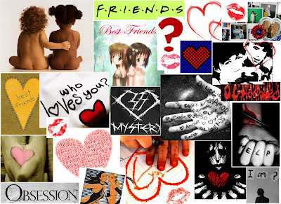
Using google I typed in words like; friendship, love, confused, obsessed, mystery, self-harm which are all key words relating to our movie. So looking at this people would have a little idea of what the film is about and maybe even establish the genre, if people find this interesting and appealing they may really be thrilled to see the movie.
These images present emotions and the stages of their friendship; from the first picture which is innocent, to the last picture which is disturbed.
LOCATION
We scouted for possible locations that would add to our opening sequence and genre.
As we had our story board and character profiles completed we knew we may need them to be in school or be out at a park or outside in a location where friends go. We were thinking to do a shot at one of the friends house but we focused on the pair being outside creating an everyday setting and atmosphere so its not such a typical, gloomy love story and the friends bein outside show they go out together and have a close bond.
We used areas on the school ground as it worked because it looked like green areas in a park and they had a big mirror in the toilets which worked perfectly for the mirror/picture final scene.


DETAILED SYNOPSIS
Leanne and Toni have been best friends for years and Leanne finally felt like she had settled in a place of her own after having moved around a lot when she was younger.As they grew up Leanne’s feelings of friendship slowly evolved into something more as she had never experienced such a closeness before. She begins to show signs of obsession by stealing some of Toni’s possessions and takes photo’s of her and puts in her scrapbook which is full of pictures of Toni. Toni becomes a little suspicious of Leanne’s changing behaviour towards her, and finally decides to confront her where Leanne then leaks all her built up feelings and to her surprise Toni does not feel the same. Toni feels outraged and Betrayed as Leanne try’s to express the depth of her emotions hoping she would understand and ultimately return the love. A confused Toni refuses and Leanne’s feelings turn aggressive and lead her to attacking Toni in evil ways.
Leanne and Toni have been best friends for years and Leanne finally felt like she had settled in a place of her own after having moved around a lot when she was younger.As they grew up Leanne’s feelings of friendship slowly evolved into something more as she had never experienced such a closeness before. She begins to show signs of obsession by stealing some of Toni’s possessions and takes photo’s of her and puts in her scrapbook which is full of pictures of Toni. Toni becomes a little suspicious of Leanne’s changing behaviour towards her, and finally decides to confront her where Leanne then leaks all her built up feelings and to her surprise Toni does not feel the same. Toni feels outraged and Betrayed as Leanne try’s to express the depth of her emotions hoping she would understand and ultimately return the love. A confused Toni refuses and Leanne’s feelings turn aggressive and lead her to attacking Toni in evil ways.
Sunday 21 February 2010
FINAL IDEA - thriller
We then changed our idea to create the thriller but changed a few key points to make it more easier and possible for us to be able to film. We assigned character roles and confirmed on a location that would work as well as being convenient.
Brief Synopsis
Toni and Leanne have a very close friendship but Leanne is beginning to develop feelings for Toni and becomes almost obsessed mistaking friendship for love. Leanne ultimately confesses how she feels to Toni who does not feel the same way. Leanne results in crazy behaviour which leads her to abusing Toni in aggressive harassment.
The new story board we are going to follow, this helped us know what direction to work in and what shots would need to be in what order.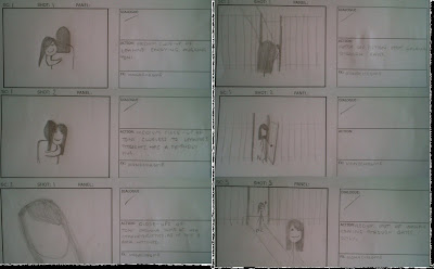
Meeting 3
-we changed out idea to the thriller one but made some improvements because we all preferred the conventions associated with the thriller and we found it easier and more convenient in terms of filming, locations and characters compared to the initial idea.
-we made a brief synopsis
-we then made a new story board for this idea
-we decided on characters and personal traits for them to make it easier to relate to and act as them.
Saturday 20 February 2010
INITAL IDEA - horror
We decided to go with horror genre movie opening sequence and thought about inital characters; Sasha being stalked by Michael. We found possible locations as to where we could film but it was a bit difficult as we could not control the lighting and we needed the lighting to be quite dark but light enough to see the characters. However, we made a story board to breifly plan the shots and techiniques we would use.

Friday 19 February 2010
MEETING NOTES
Meeting 1
We all agreed on using one of the following genres; action, thriller, horror and each came up with a different storyline for our opening sequence for the different genres.
Action- focuses on the contrasting life of a man being a bounty killer, where we see a male figure in danger and having a fight and his real life, which would be presented by dancers to evoke a softer side of his life. We would use harsh edits of him fighting and a split screen effect to show the dancers and the music would just be a beat which is quite soft but the beat drops to be a bit aggressive.
Thriller – Highlighting the man in a couple to being a serial killer of his ex partners as his obsession towards them grows in a twisted psychotic way. This couple have been together for a long period and he wants to get married but she doesn’t so as his obsession is developing, we have flashbacks of his history of murder. We will then relate the flashbacks to his present by using camera edits and special effects. The soundtrack for this would have to be composed yet strong to illustrate the sinister mood.
Horror – based on a stalker who has a history of attacking young, vulnerable girls. In the opening sequence he is presented only by extra close-ups so his identity is hidden to add mystery. His target is a young girl coming back tipsy from a party, as she waits at the bus stop he takes continuous pictures of her but she is clueless. Then we see his silhouette jump on her to assault her and a flash closes the opening scene and the title appears. Music would be high pitched but also composed to add a suspicious atmosphere.
Meeting 2
-we decided to use the Horror genre storyline
-we created a story board for this idea
-we thought about various techniques to use to add the specific effect we were looking for, such as; fading, filters, blurry effects etc.
-we scouted for possible locations; we found a park and a bus stop
-we decided on initial characters
-we created a story board for this idea
-we thought about various techniques to use to add the specific effect we were looking for, such as; fading, filters, blurry effects etc.
-we scouted for possible locations; we found a park and a bus stop
-we decided on initial characters
Thursday 18 February 2010
ANALYSIS OF OPENING SEQUENCES
JUNO
http://www.artofthetitle.com/2008/04/15/juno/
This opening sequence starts off in real and transforms into an rotoscoped color-pencil animated scene. we see the protagonist who we think is Juno at this point; her slouch jeans, converses and hoody suggest she is a very laid back, normal teenanger which alot of girls could relate to making them the target audience.
The animation in this scene reflect on the character, we can tell she is not a serious character and she is light hearted which also helps us establish the genre is most likely to be a modern comedy or maybe a rom-com. Also, the animation effect helps keep a young atomosphere intact engaging the target audience.
She is drinking right out of the Sunny D bottle, she is represented almost as if she doesnt care about much or what people think resulting in a 'badass' look. Also, the way she is walking connotes this, she looks careless and as if she has no worries what so ever which could be contrasted in the plot of the movie. The sunny D bottle almost becomes an icon connoting a young and happy mood that you see transorm from real to animation as well as Juno which could be relating to some of her characteristics.we dont see much scenery buh can just about establish where this movie take place.
The different backgrounds are sketched on showing ordinary high streets, this movie is set in an everyday atmosphere and surroundings. So we are expecting to step into Juno's life and see what obsticles she undergoes on a day to day basis and as she looks quite young, we could possibly see her in school.
The music playing is a cool, country like song setting a laid back, funny atmosphere which also connotes to a light hearted comedy.
Alot of editing is used in this scene, creating the animation, indication of titles and character names etc. ovcourse it looks very proffessional but still has a young feel to it for the target audience to enjoy. The titles and names look hand written and appear on the screen in various ways showing off editing techniques and still engaging the audience. Such an amusing opening sequence will make the audience expect alot from the movie and to enjoy it if satisfied.
Several camera angels and movements were used illustrating an upbeat, hectic film with an interesting storyline and plot. One close-up shot of Juno's feet suggest we are going to walk in her shoes and see what goes on in her life, making her the protagonist.she walks past a guitar shop and a guitar and tv which imply these are the things she loves.
She is just wondering through animated streets, she looks lost and confused something may happen to her later where she feels like this. We do not see any other characters in this opening sequence suggesting she is really the main character and we should focus on her thoroughly.
I enjoyed this interesting opening sequence and liked the effect however, this would not work for my film opening as it would not reflect my genre and atmosphere of a Thriller.
COMPARING AND CONTRASTING BRIDGET JONES’S DIARY AND NOTTING HILL
http://www.youtube.com/watch?v=tcGyU7MumTw
http://www.tudou.com/programs/view/_27ug8_vTcc/
Both Bridget Jones’s Diary and Notting Hill are very well known romantic-comedies. We can establish the genre from the opening of both movies as they both begin with romantic, soft music and the voice over’s at the start describe their lonely lives and attempts to find love.
In Bridget Jones’s Diary the scene opens with a mid-shot of Bridget walking alone in the snow to her mother’s house for New Years while the voice over is going on in the background. The voice over acts like a narrator explaining a bit about her mother, what she thinks about Mark and the things she would only say in her head.
The audience can establish that Bridget is a lonely woman looking for love. In this first scene we can see Bridget dressed in many layers, not very stylish suggesting she does not care how she looks because she has no-one to impress which creates a depressing feeling.
The cold, snowy weather plays pathetic fallacy here because it is adds to the depressing, low atmosphere as well as the low key lighting at the start suggesting a sad and gloomy mood, which is a contrast to Notting Hill’s atmosphere.
In the opening scene of Notting hill we hear flashes and cheering with no image as the title is up. As the continuous images start, they fade onto the screen and soft, romantic music is playing in the background helping the audience establish the genre. The pictures of Anna Scott, a beautiful, famous actress portray her as an elegant, glamorous, lovable woman within the first 30seconds as a light-hearted and calm feeling is present. Low-key lighting is used in this first scene at the background and Anna Scott is seen in high-key lighting charging the focus on her suggesting she is an important character. We see a bit of her Hollywood life which then fades out into William’s diverse, ordinary lifestyle and the voice over begins.
The audience can already tell these are the two protagonists and there may be a connection between them.
In the voiceover William goes on to talking a bit about Anna Scott as if he could only dream about her as he gets back to reality he depicts his ordinary lifestyle in London’s Notting Hill.
Bridget seems to spend every New Year at her mother’s ‘turkey curry buffet’, who is trying to set Bridget up every year illustrating that she is desperate to find her daughter a man she can be happy with since she is getting older. This year she meets Mark Darcy, who she thinks may be alright until he turns around in slow-mo with twinkly music playing in the background suggesting he might just be something special, she sees his reindeer jumper, the music stops and she changes her mind. A close up emerges of his face as he rolls his eyes wishing he was not in the position he was when Bridget is talking nonsense to him, drink and cigarette in hand, the audience can tell a bit more about her character; she seems slightly ditsy, funny and typical, however the target audience of young to middle aged women could maybe relate to her.
She then overhears Mark slating her off and there is a close-up shot of her ‘life changing moment’ as she realized she really didn’t want to be alone this time next year.
William also seems to have a life changing moment when Anna Scott enters his book shop the audience can sense a connection as they seal eye contact and the way he tracks her as she is walking round he shop, the camera moves elegantly reflecting Anna’s grace and beauty.
It looks as if she just wants to fit in with the ‘normal world’ and not have the press around her 24/7.
We are also introduced to William’s lodger Spike, he is illustrated as immature and quite vulgar seeing his t-shirts and as he walks around in his pants. His long hair and unshaven beard suggest he does not take duty of him-self which looks like a big contrast to William.
We see Bridget at home alone after the Mark incident; A close up of the T.V show ‘Frasier’ demonstrates a sad, day-time T.V show which would get her depressed as well as having no messages on her answering machine connotes her loneliness.
Finally she breaks out in to an overdue, well needed emotional fit, singing to ‘all by myself’ which is a reflection of exactly how she feels and is almost angry that she is alone. The long shot lets us see that she is alone in a messy room, sitting in her pyjamas, drinking wine and she looks miserable with her head hanging.
These two movies are typical rom-coms and follow Todorov’s theory of narrative structure including an; equilibrium, a disruption, recognition of disruption, attempt to repair the disruption and a new equilibrium is accomplished.
In both movies, Bridget and William seem abandoned from love and long-term relationships, they both go through a journey where they find someone who they love which then is disturbed but at the end a new equilibrium is achieved and they both live happily with their partner.
These movies are both rom-coms so we would not use any aspects from them as our movie is a thriller and we are trying to get a different reaction and atmospheres across. However, i looked at them to contrast to our movie as they use different lighting, shots, camera angles and music to set the appropriate mood they would need but we both are trying to engage a set audience.
BATMAN
http://www.youtube.com/watch?v=l6prDFbjn_Q
The opening sequence of Batman Begins sets a sinister tone with the shot of the swarm of bats flying in the dark sky making up the renowned Batman sign thrilling the audience right from the start. The bats are contrasted against the dark, cloudy sky so we can see the batman symbol of power connoting Batman is powerful and he can battle against evil even through darkness.
We then are introduced two children playing and running around with a blurred camera shot panning them running through the gardens which brings the audience into action and feel as if they are running with characters and waiting for something on the other side, we assume the two children are the protagonists. We see them fighting over the spear head which represents fighting, setting a key theme for the film so we are expecting to see alot of fighting. The children are dressed in contemporary clothes helping the audience identify and possibly relate to the characters.
When Bruce falls into a well where he finds a swarm of bats the camera moves towards the dark hole to put us in Bruce’s position and fear what we are about to see, from this his fear developed. A high angle shot from the top of the well represents how far he has fallen and the long journey he is about to embark upon.
The long shot after that incident displays a mansion which is significant to show where Bruce lives and it tells us he comes from a wealthy background. Several close ups are used to illustrate the characters emotions and reactions, such as when Bruce fell into the well, this was also shown from various angles to set a fast-pace mysterious atmosphere.
In the later shots we see Bruce as a man and an aggressive one too as he begins a fight with many people in his prison. As one obvious theme is fighting in this movie, we can establish that fear is also a theme as his fear of bats presents the movie to be a journey of him overcoming his fear or in this case to be it.
Music throughout this opening is quiet but there is a beat that gets louder as Bruce falls into the well; back to quiet when he looks into the darkness then suddenly goes loud when the bats fly at him, setting suspense and making the audience concentrate so much they connect with the characters feelings of fear. Also the screeching and flapping of the bats sets a tone of panic and fear.
This movie opening sequence was successful and effective in engaging the audience leaving them to wonder how he overcomes his fear and how he becomes batman.
We want this effect in our opening sequence but we don’t want so many long shots as we want to uphold a sense of mystery and lack of identity. Our sound could be similar as we want to create suspense and vagueness which hopefully keeps the audience engaged. However, our genre is a thriller and not action-horror but there are some aspects we could use as inspiration.
Wednesday 17 February 2010
KYLE COPPER
Kyle Cooper is a well known, contempory designer for motion picture title sequences creating many openings for big movies such as; The Incredible Hulk, Flubber, Godzilla, Superman and many more.
His main influence being Stephen Frankfurt who produced the opening title sequence for 'To Kill a Mockingbird', 1962.
Cooper has directed over 150 film title sequences and recieved a M.F.A in Graphic Design from the Yale School of Art which is benefitting him alot.
He is the founder of two internationally recognized film design companies; Imaginary Forces and Prologue Films.
http://www.prologue.com/ is a very inspiring site as it illustrates various, famous title sequences and shows the first 6shots of the openings, breaking it down so we can see what they consist of and we had to make sure we included the little details shown which help the audience establish the characters, titles, names, genre and what the film may contain yet still engaging them.
Tuesday 16 February 2010
SAUL BASS  Saul Bass was an award-winning filmmaker working on motion picture title sequences. As he was also a graphic designer his animated sequences were what he became best known for, making him one of Hollywood's greatest filmmakers in his 40-year career.
Bass studied at the Art Students League and then moved onto Brooklyn College. He began by doing print work for film adverts and soon collaborated with filmmaker Otto Preminger to design the film poster for 'Carmen Jones' in 1954.
As Otto was very impressed he gave Saul the opportunity to design the title sequence aswell resulting in Bass becoming widley known in the industry and leading him to create several others including; Casino, Pyscho, Goodfellas, Cape fear and many more.
His graphic designing passion helped him in producing various yet the most iconic logos in North America consisting of; Dixie, United Way, Continental Airlines etc.
Also in creating Movie posters for five decades for many movies such as; Vertigo, West Side Story, The Shining etc. where he worked with Otto some more and Alfred Hitchcock.
Saul Bass was an award-winning filmmaker working on motion picture title sequences. As he was also a graphic designer his animated sequences were what he became best known for, making him one of Hollywood's greatest filmmakers in his 40-year career.Bass studied at the Art Students League and then moved onto Brooklyn College. He began by doing print work for film adverts and soon collaborated with filmmaker Otto Preminger to design the film poster for 'Carmen Jones' in 1954.
As Otto was very impressed he gave Saul the opportunity to design the title sequence aswell resulting in Bass becoming widley known in the industry and leading him to create several others including; Casino, Pyscho, Goodfellas, Cape fear and many more.
His graphic designing passion helped him in producing various yet the most iconic logos in North America consisting of; Dixie, United Way, Continental Airlines etc.
Also in creating Movie posters for five decades for many movies such as; Vertigo, West Side Story, The Shining etc. where he worked with Otto some more and Alfred Hitchcock.
Sunday 14 February 2010
PRELIMINARY TASK EVALUATION
For the preliminary task we was in a group of three; Georgina, Anisha and me.
We had a criteria we had to ensure we followed for this task, we had to have:
1. a character opening a door
2. a character crossing a room
3. a character sitting down in a chair opposite another character
Also, we had to include:
- dialogue
- match on match shot
- shot reverse shot
- follow the 180 degree rule
We began by researching some other AS media students preliminary tasks on YouTube which would give us an indication of how it had to look and examples of the scenarios we could have chosen to do. We also evaluated a couple of the videos so we could see whos was better and what helped them be better than the others so we could include the little details to make ours a good first preliminary task.
We then decided on a scenario and who will do what in this task. Our scene will be of a student (me) who has been sent to the headteachers office (Anisha) for being a naughty girl in school. Leaving Georgina to be the director and camera-woman. We all agreed on this as we could film in the school making it more appropriate for all of us and easier because we would be able to film anyday and time when we are in school.
Before we actually starting shooting, we researched and analysed editing techniques and camera shots and angles and found some we thought we could use. We then made a storyboard which would direct us in knowing what shot we would use in series.
The filming began and for me it was the first task in Media where we had cameras and had to do some acting but after practicing a couple shots I got more comfortable infront of the camera and we was on a roll.
Filming in the school corridors whilst everyone else was in lesson and in a quiet room which looked like a teachers office helped the dialogue be heard clear and loud.
We used many different camera shots we had learnt about earlier. Ensuring we clearly included the shots and movements we had to from our criteria making it simple aswell as ticking all the boxes.
We had difficulties in making the shot reverse shot in time with the dialogue so we had to re-shoot that part to make it flow more. From then, we just edited our sequence in the editing suite focusing on just showing what we had to show in the criteria and not making it too complicated. We added a title and cut some shots so it went together more smoothly to result in our final preliminary task.
We managed to follow the criteria and include everything we needed to for the task overcoming the problems we had in as a team.
The location worked with our scenario which was very useful as we had access to all the rooms and we knew what time would be best to film when everyone was in lesson and it would be quiet so dialogue could be heard.
Each shot was illustrated to an appropriate standard and overall it was a success as it was our first filming task together and we got along very well and each person did what they need as part of their input so we decided to work together for our next task.
Saturday 13 February 2010
Subscribe to:
Posts (Atom)