EXPERIMENTING WITH FONTS FOR TITLES
I looked at this website to find appropriate typography for our titles; http://www.flamingtext.com/
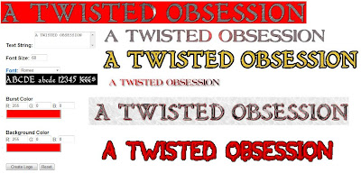
I tested out some differnt fonts experimenting with different colours, background colours and fonts to ensure we picked the perfect, most professional font for our titles but i didnt think any of these looked right or professional enough so we didnt use any of these.
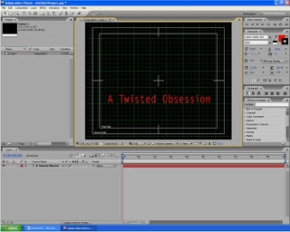
Instead we just used a simple and clear font from the Adobe After Effect programme but changed the colour to red as that is a key colour running through our opening sequence and production logo connoting danger as well as love.
I looked at this website to find appropriate typography for our titles; http://www.flamingtext.com/

I tested out some differnt fonts experimenting with different colours, background colours and fonts to ensure we picked the perfect, most professional font for our titles but i didnt think any of these looked right or professional enough so we didnt use any of these.
Instead we just used a simple and clear font from the Adobe After Effect programme but changed the colour to red as that is a key colour running through our opening sequence and production logo connoting danger as well as love.

We also looked through effects and presets to see how we want the writing to enter the shots and decided to merge 'evaporate' and 'wordflash' together, these both work together to create the effect which adds suspense and is interesting to watch.
No comments:
Post a Comment